Visualization#
gammapy.visualization provides a few helper functions and classes to create
publication-quality images.
Colormaps#
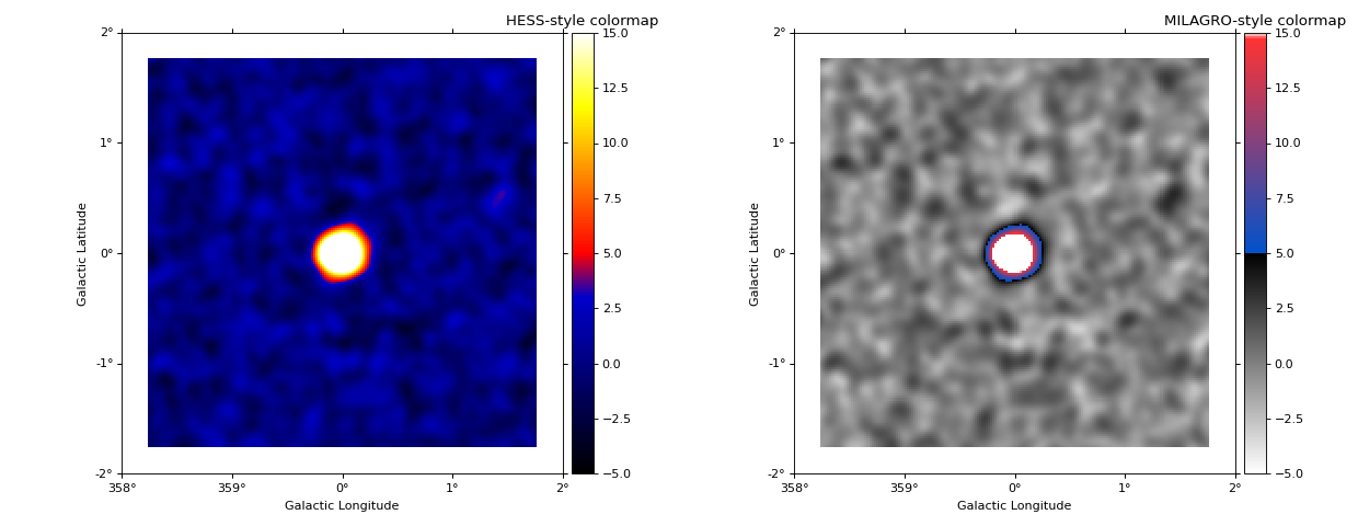
The following example shows how to plot images using colormaps that are commonly
used in gamma-ray astronomy (colormap_hess and colormap_milagro).
"""Plot significance image with HESS and MILAGRO colormap."""

from astropy.visualization import LinearStretch
from astropy.visualization.mpl_normalize import ImageNormalize
import matplotlib.pyplot as plt
from gammapy.maps import Map
from gammapy.visualization import colormap_hess, colormap_milagro

filename = "$GAMMAPY_DATA/tests/unbundled/poisson_stats_image/expected_ts_0.000.fits.gz"
image = Map.read(filename, hdu="SQRT_TS")

# Plot with the HESS and Milagro colormap
vmin, vmax, vtransition = -5, 15, 5
fig = plt.figure(figsize=(15.5, 6))

normalize = ImageNormalize(vmin=vmin, vmax=vmax, stretch=LinearStretch())
transition = normalize(vtransition)

ax = fig.add_subplot(121, projection=image.geom.wcs)
cmap = colormap_hess(transition=transition)
image.plot(ax=ax, cmap=cmap, norm=normalize, add_cbar=True)
plt.title("HESS-style colormap")

ax = fig.add_subplot(122, projection=image.geom.wcs)
cmap = colormap_milagro(transition=transition)
image.plot(ax=ax, cmap=cmap, norm=normalize, add_cbar=True)
plt.title("MILAGRO-style colormap")

plt.tight_layout()
plt.show()
Color-blind friendly visualizations can be achieved using the style sheet of matplotlib (see the Change plotting style and color-blind friendly visualizations section).
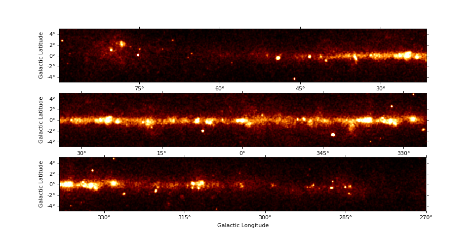
Survey panel plots#
The MapPanelPlotter allows to split e.g. a galactic plane survey image with
a large aspect ratio into multiple panels. Here is a short example:
import matplotlib.pyplot as plt
from astropy.coordinates import SkyCoord, Angle
from gammapy.maps import Map
from gammapy.data import EventList
from gammapy.visualization import MapPanelPlotter

skydir = SkyCoord("0d", "0d", frame="galactic")
counts = Map.create(skydir=skydir, width=(180, 10), frame="galactic")

events = EventList.read("$GAMMAPY_DATA/fermi_3fhl/fermi_3fhl_events_selected.fits.gz")
counts.fill_events(events)

smoothed = counts.smooth("0.1 deg")

fig = plt.figure(figsize=(12, 6))
xlim, ylim = Angle(["90d", "270d"]), Angle(["-5d", "5d"])
plotter = MapPanelPlotter(figure=fig, xlim=xlim, ylim=ylim, npanels=3)

axes = plotter.plot(smoothed, vmax=10)
plt.show()
