Note
Go to the end to download the full example code or to run this example in your browser via Binder.
Flux Profile Estimation#
Learn how to estimate flux profiles on a Fermi-LAT dataset.
Prerequisites#
Knowledge of 3D data reduction and datasets used in Gammapy, see for instance the first analysis tutorial.
Context#
A useful tool to study and compare the spatial distribution of flux in images and data cubes is the measurement of flux profiles. Flux profiles can show spatial correlations of gamma-ray data with e.g. gas maps or other type of gamma-ray data. Most commonly flux profiles are measured along some preferred coordinate axis, either radially distance from a source of interest, along longitude and latitude coordinate axes or along the path defined by two spatial coordinates.
Proposed Approach#
Flux profile estimation essentially works by estimating flux points for a set of predefined spatially connected regions. For radial flux profiles the shape of the regions are annuli with a common center, for linear profiles it’s typically a rectangular shape.
We will work on a pre-computed MapDataset of Fermi-LAT data, use
SkyRegion to define the structure of the bins of the flux profile and
run the flux profile extraction using the FluxProfileEstimator
import numpy as np
from astropy import units as u
from astropy.coordinates import SkyCoord

# %matplotlib inline
import matplotlib.pyplot as plt
Setup#
from IPython.display import display
from gammapy.datasets import MapDataset
from gammapy.estimators import FluxPoints, FluxProfileEstimator
from gammapy.maps import RegionGeom
from gammapy.modeling.models import PowerLawSpectralModel
from gammapy.utils.regions import (
    make_concentric_annulus_sky_regions,
    make_orthogonal_rectangle_sky_regions,
)
Read and Introduce Data#
dataset = MapDataset.read(
    "$GAMMAPY_DATA/fermi-3fhl-gc/fermi-3fhl-gc.fits.gz", name="fermi-dataset"
)
This is what the counts image we will work with looks like:
counts_image = dataset.counts.sum_over_axes()
counts_image.smooth("0.1 deg").plot(stretch="sqrt")
plt.show()
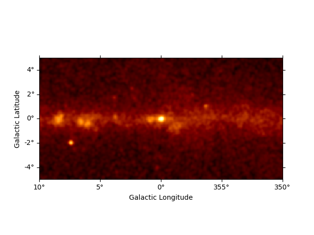
There are 400x200 pixels in the dataset and 11 energy bins between 10 GeV and 2 TeV:
print(dataset.counts)
WcsNDMap

        geom  : WcsGeom
        axes  : ['lon', 'lat', 'energy']
        shape : (np.int64(400), np.int64(200), 11)
        ndim  : 3
        unit  :
        dtype : >i4
Profile Estimation#
Configuration#
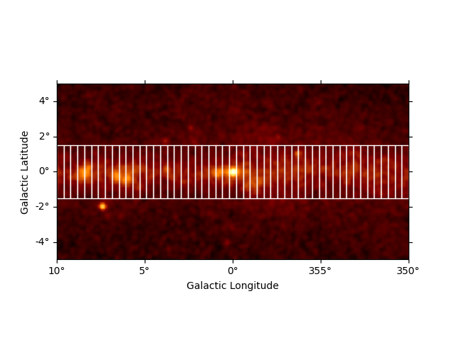
We start by defining a list of spatially connected regions along the
galactic longitude axis. For this there is a helper function
make_orthogonal_rectangle_sky_regions. The individual region bins
for the profile have a height of 3 deg and in total there are 31 bins.
Its starts from lon = 10 deg and goes to lon = 350 deg. In addition, we
have to specify the wcs to take into account possible projections
effects on the region definition:
regions = make_orthogonal_rectangle_sky_regions(
    start_pos=SkyCoord("9d", "0d", frame="galactic"),
    end_pos=SkyCoord("351d", "0d", frame="galactic"),
    wcs=counts_image.geom.wcs,
    height="3 deg",
    nbin=49,
)
We can use the RegionGeom object to illustrate the regions on top of
the counts image:
geom = RegionGeom.create(region=regions)
ax = counts_image.smooth("0.1 deg").plot(stretch="sqrt")
geom.plot_region(ax=ax, color="w")
plt.show()
Next we create the FluxProfileEstimator. For the estimation of the
flux profile we assume a spectral model with a power-law shape and an
index of 2.3
flux_profile_estimator = FluxProfileEstimator(
    regions=regions,
    spectral_model=PowerLawSpectralModel(index=2.3),
    energy_edges=[10, 2000] * u.GeV,
    selection_optional=["ul"],
)
We can see the full configuration by printing the estimator object:
print(flux_profile_estimator)
FluxProfileEstimator
--------------------

  allow_multiple_telescopes : False
  energy_edges              : [  10. 2000.] GeV
  fit                       : <gammapy.modeling.fit.Fit object at 0x7f8ef1947a40>
  n_jobs                    : None
  n_sigma                   : 1
  n_sigma_sensitivity       : 5
  n_sigma_ul                : 2
  norm                      : Parameter(name='norm', value=1.0, factor=1.0, scale=1.0, unit=Unit(dimensionless), min=nan, max=nan, frozen=False, prior=None, id=0x7f8ee9f9acc0)
  null_value                : 0
  parallel_backend          : None
  reoptimize                : False
  selection_optional        : ['ul']
  source                    : 0
  spectral_model            : PowerLawSpectralModel
  sum_over_energy_groups    : False
Run Estimation#
Now we can run the profile estimation and explore the results:
profile = flux_profile_estimator.run(datasets=dataset)

print(profile)
FluxPoints
----------

  geom                   : RegionGeom
  axes                   : ['lon', 'lat', 'energy', 'projected-distance']
  shape                  : (1, 1, 1, 49)
  quantities             : ['norm', 'norm_err', 'norm_ul', 'ts', 'npred', 'npred_excess', 'stat', 'stat_null', 'counts', 'success']
  ref. model             : pl
  n_sigma                : 1
  n_sigma_ul             : 2
  sqrt_ts_threshold_ul   : 2
  sed type init          : likelihood
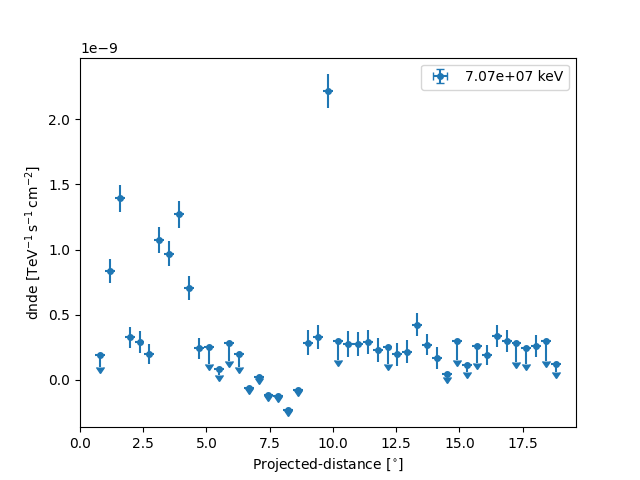
We can see the flux profile is represented by a FluxPoints object
with a projected-distance axis, which defines the main axis the flux
profile is measured along. The lon and lat axes can be ignored.
Plotting Results#
Let us directly plot the result using plot:
ax = profile.plot(sed_type="dnde")
ax.set_yscale("linear")
plt.show()
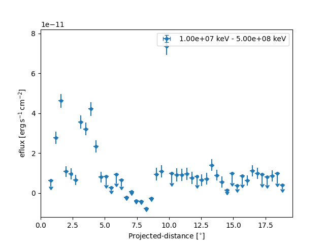
Based on the spectral model we specified above we can also plot in any other sed type, e.g. energy flux and define a different threshold when to plot upper limits:
profile.sqrt_ts_threshold_ul = 2

plt.figure()
ax = profile.plot(sed_type="eflux")
ax.set_yscale("linear")
plt.show()
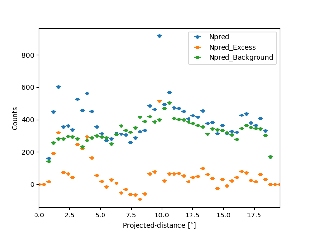
We can also plot any other quantity of interest, that is defined on the
FluxPoints result object. E.g. the predicted total counts,
background counts and excess counts:
quantities = ["npred", "npred_excess", "npred_background"]

fig, ax = plt.subplots()

for quantity in quantities:
    profile[quantity].plot(ax=ax, label=quantity.title())

ax.set_ylabel("Counts")
ax.legend()
plt.show()
/home/runner/work/gammapy-docs/gammapy-docs/gammapy/.tox/build_docs/lib/python3.12/site-packages/gammapy/maps/region/ndmap.py:154: UserWarning: This axis already has a converter set and is updating to a potentially incompatible converter
  ax.errorbar(
Serialisation and I/O#
The profile can be serialised using write, given a
specific format:
profile.write(
    filename="flux_profile_fermi.fits",
    format="profile",
    overwrite=True,
    sed_type="dnde",
)

profile_new = FluxPoints.read(filename="flux_profile_fermi.fits", format="profile")

ax = profile_new.plot()
ax.set_yscale("linear")
plt.show()

The profile can be serialised to a Table object
using:
table = profile.to_table(format="profile", formatted=True)
display(table)
       x_min                x_max               x_ref        ... counts success
        deg                  deg                 deg         ...
-------------------- ------------------- ------------------- ... ------ -------
-0.18367346938775508 0.18367346938775508                 0.0 ...  328.0    True
 0.18367346938775508  0.5510204081632653 0.36734693877551017 ...  607.0    True
  0.5510204081632653  0.9183673469387759  0.7346938775510206 ...  405.0    True
  0.9183673469387759   1.285714285714286   1.102040816326531 ...  322.0    True
   1.285714285714286  1.6530612244897958   1.469387755102041 ...  344.0    True
  1.6530612244897958  2.0204081632653064   1.836734693877551 ...  311.0    True
  2.0204081632653064   2.387755102040817   2.204081632653062 ...  484.0    True
   2.387755102040817   2.755102040816327   2.571428571428572 ...  537.0    True
   2.755102040816327  3.1224489795918373  2.9387755102040822 ...  487.0    True
                 ...                 ...                 ... ...    ...     ...
  14.142857142857132  14.510204081632645  14.326530612244888 ...  267.0    True
  14.510204081632645  14.877551020408161  14.693877551020403 ...  291.0    True
  14.877551020408161  15.244897959183646  15.061224489795904 ...  357.0    True
  15.244897959183646  15.612244897959162  15.428571428571404 ...  374.0    True
  15.612244897959162  15.979591836734677   15.79591836734692 ...  386.0    True
  15.979591836734677   16.34693877551019  16.163265306122433 ...  368.0    True
   16.34693877551019  16.714285714285705  16.530612244897945 ...  321.0    True
  16.714285714285705  17.081632653061217   16.89795918367346 ...  361.0    True
  17.081632653061217   17.44897959183673  17.265306122448973 ...  385.0    True
   17.44897959183673   17.81632653061222  17.632653061224474 ...  319.0    True
Length = 49 rows
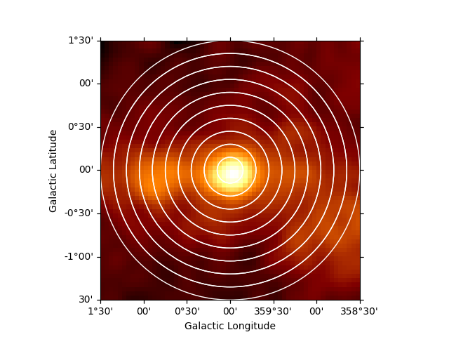
No we can also estimate a radial profile starting from the Galactic center:
regions = make_concentric_annulus_sky_regions(
    center=SkyCoord("0d", "0d", frame="galactic"),
    radius_max="1.5 deg",
    nbin=11,
)
Again we first illustrate the regions:
geom = RegionGeom.create(region=regions)
gc_image = counts_image.cutout(
    position=SkyCoord("0d", "0d", frame="galactic"), width=3 * u.deg
)
ax = gc_image.smooth("0.1 deg").plot(stretch="sqrt")
geom.plot_region(ax=ax, color="w")
plt.show()
This time we define two energy bins and include the fit statistic profile in the computation:
flux_profile_estimator = FluxProfileEstimator(
    regions=regions,
    spectral_model=PowerLawSpectralModel(index=2.3),
    energy_edges=[10, 100, 2000] * u.GeV,
    selection_optional=["ul", "scan"],
)
The configuration of the fit statistic profile is done through the norm parameter:
flux_profile_estimator.norm.scan_values = np.linspace(-1, 5, 11)
Now we can run the estimator,
profile = flux_profile_estimator.run(datasets=dataset)
and plot the result:
profile.plot(axis_name="projected-distance", sed_type="flux")
plt.show()
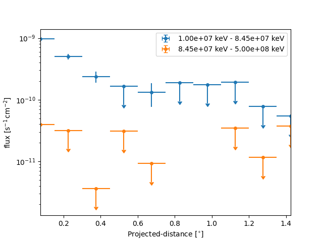
However because of the powerlaw spectrum the flux at high energies is much lower. To extract the profile at high energies only we can use:
profile_high = profile.slice_by_idx({"energy": slice(1, 2)})
plt.show()
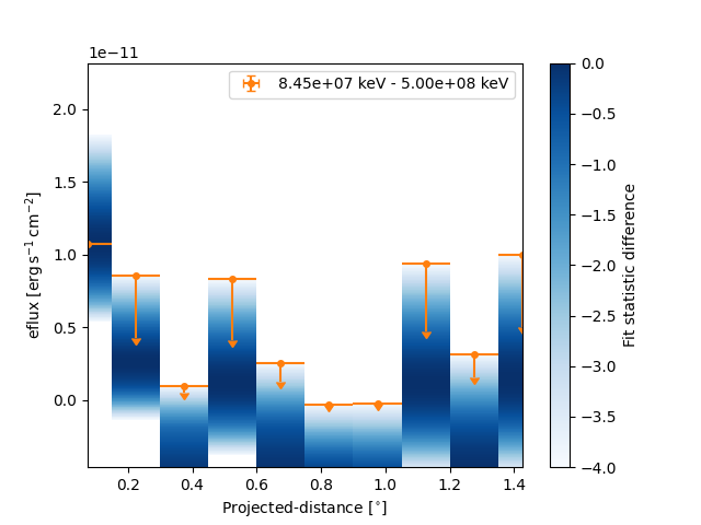
And now plot the points together with the likelihood profiles:
fig, ax = plt.subplots()
profile_high.plot(ax=ax, sed_type="eflux", color="tab:orange")
profile_high.plot_ts_profiles(ax=ax, sed_type="eflux")
ax.set_yscale("linear")
plt.show()
Total running time of the script: (0 minutes 19.000 seconds)